

Notice something different about this month’s Geist Community Newsletter? Perhaps the new “GEIST” logo on the cover, more white space and bigger photos struck your fancy. Well, if you noticed any or all of these changes, you deserve a little background as to why we overhauled the Geist area’s most-read monthly publication. (view online)
As many of you know, we launched the Geist Community Newsletter 10 years ago as a photocopied black-and-white newsletter that was mailed to just over 2,600 Geist residents. Since that time, we’ve expanded the distribution, enhanced the quality, and reinvested our time and money back into making the publication the voice of all that’s right with our community.
Today we have six monthly publications (Geist, Fishers, Carmel, Zionsville, Lawrence and Center Grove) around Indianapolis with another three (Broad Ripple, Noblesville and Morse Reservoir) launching next month. This growing family of publications is now defined as the “TownePost Media Network,” which is now on the cover.
Why are we expanding so quickly while traditional media outlets are shrinking? Because people want more local good news.
To that end, we wanted to update the newsletters to reflect the upscale nature of our readers and neighborhoods that we serve each month. While most of the changes are subtle, others are a little more pronounced. Here’s a cheat sheet of the upgrades we introduced with this month’s issue:
- Upgraded paper: People love the feel of paper when they are reading a magazine, so we upgraded the paper to a more contemporary matte finish. It should not only feel better, but you can read it easier with less glare on the finish.
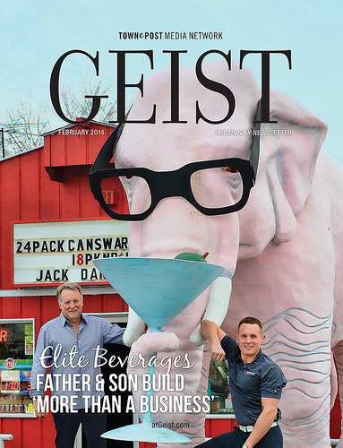
- New masthead: Probably the first thing you noticed is the “GEIST” on the cover is different. Our old masthead tended to overpower the cover photos; the new one is a bit more elegant.
- More white space: Each page now has more white space around the copy and photos, again giving the pages a more elegant and refined look. This also helps readability and looks less cluttered.
Bigger photos: A story is only as good as the pictures. Our new design allows for more, larger photos to complement the stories.
![]() We all hope you enjoy the “new and improved” Geist Community Newsletter. Remember to follow us on Facebook, Twitter and Instagram as well as online at atGeist.com. Our commitment to providing local news doesn’t stop with this publication, so look us up online throughout the month.
We all hope you enjoy the “new and improved” Geist Community Newsletter. Remember to follow us on Facebook, Twitter and Instagram as well as online at atGeist.com. Our commitment to providing local news doesn’t stop with this publication, so look us up online throughout the month.
